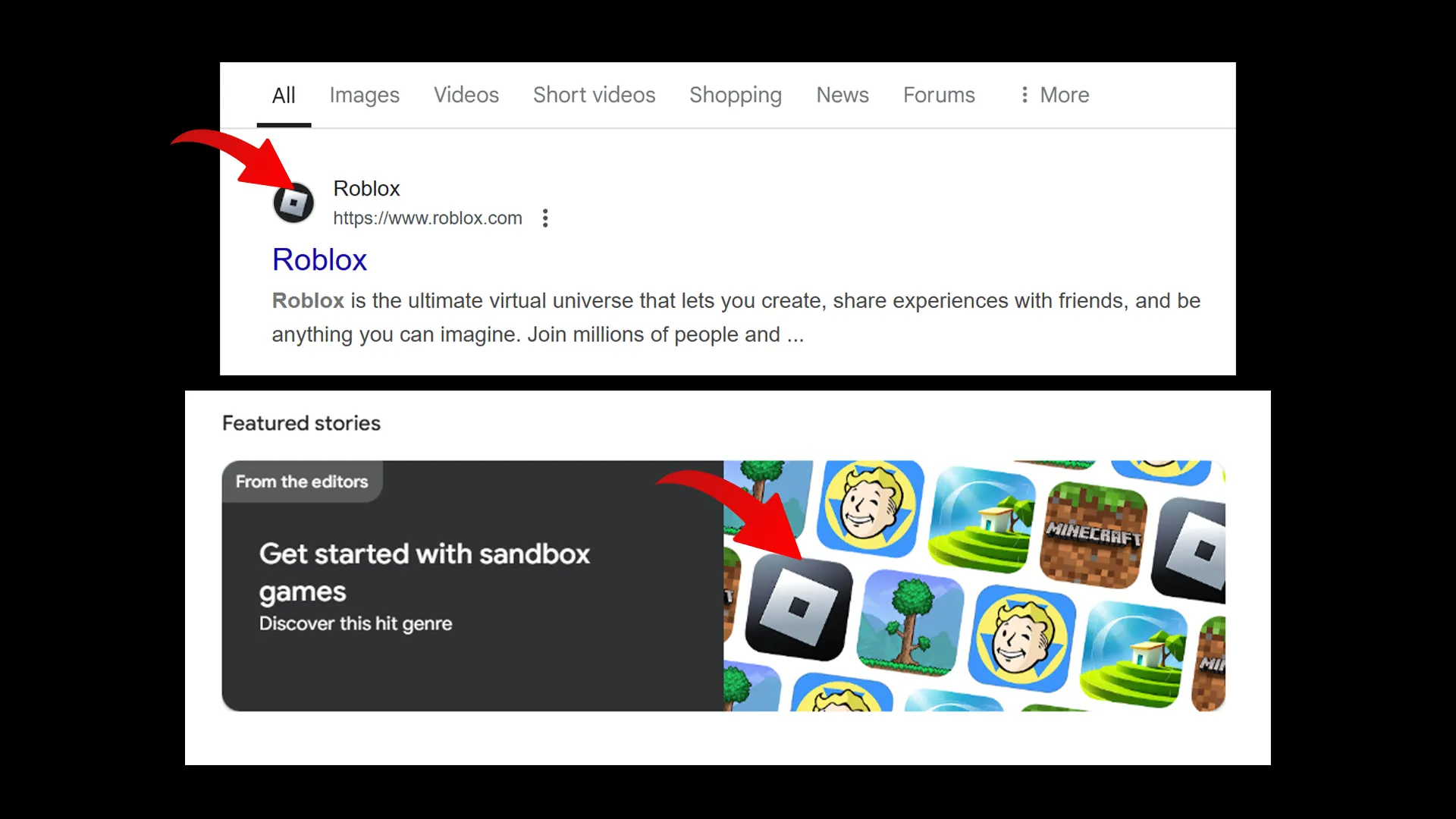
Roblox players have seen the iconic grey, white, and black logo on the platform for a long time. On August 26, 2022, via a blogpost, Roblox shared its “refreshed” icon to reflect its vision. They explained, “The Roblox logo currently has distinctiveness with its tilt, which represents building, progression, and motion. In refining it, we wanted to retain the equity of the tilt while also reflecting the evolution of our platform.” So, why is the Roblox logo blue now?
Roblox New Blue vs Old Grey Logo
While there is no blog post explaining the change yet, the 2025 shift to a blue accent, particularly the vivid blue (#1446FF) used for the play button, app icon background, and key UI elements, appears to be driven by several factors, including consistency, usability, and brand perception.
Using a single color makes styling your product simpler, cuts down on extra design work, and keeps every interface (from desktop to mobile) feeling much more cohesive.
Vivid blue also offers greater contrast against both light and dark backgrounds compared to the previous hues. Strong contrast is essential for readability and also helps Roblox meet accessibility best practices.
There more! Blue is among the most popular colors in tech and corporate branding because it evokes trust, reliability, and professionalism. By choosing a bold shade of blue, Roblox may want to stand alongside other digital platforms (such as Discord and Facebook) and communicate maturity as it expands beyond its gaming roots into broader metaverse experiences.
Remnants of the old grey logo with its central O cut out and with muted metallic tones still appear in various banners and sections of the website as of now.

Many players on Reddit are missing the previous silver look, calling it “black and silver wins” or “I preferred the old grey,” while others appreciate the vibrancy of the new logo, noting that blue “just pops more in the taskbar.” There’s also a discussion on why they chose blue instead of red.
So, to conclude, Roblox’s switch from a grey/silver icon to a vivid blue new logo represents a visual refresh and contemporary vibe, while taking a step toward its evolution to its next era.

