Reggie Fils-Aime former president and chief operating officer of Nintendo America revealed, Nintendo marketing department was almost ready to change Nintendo’s Logo under perspective it may appeal to a broader age-group of the audience, as it was seen as kiddy.
Nintendo with an objective to make the logo more “adult-friendly” that will add a broader age-group of the audience into the picture, played around the idea of bringing a new logo to make it a lot more appealing and not just for kids. Marketing Team had almost started working on the new logo by adding graffiti style and doing various other things, but Regie felt this is not what Nintendo as a brand stood for.
Reggie saw this as progress in the wrong direction – sharing his views in a podcast, he commented that from a branding standpoint, it is extremely important to have complete clarity that as a brand what Nintendo Stood for and not doing it in some false way.
From a branding standpoint, we had to be clear in what Nintendo as a brand stood for, as well as what the individual franchises stood for. I’ll give you an example.
When I joined Nintendo, there was a sense of almost shame that Nintendo appealed to young consumers, and the marketing team at Nintendo of America started doing things with the logo – that classic Nintendo logo in an oval – they would put it into graffiti style, or they’d do different things to try and age up the logo, and I put a stop to that because that is not our brand. And what we needed to do was yes, appeal to a broad swatch of consumers, but we needed to do it based on what the brand stood for, and not doing it in some false way.

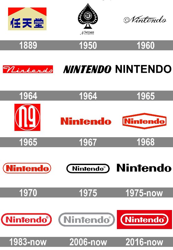
Current Nintendo logo with a red background was introduced in 2016 and still used, Reggie did not feel right in adding up a new logo seen under a viewpoint that it is kiddish. Usually introducing a new logo is a kind of trend in the gaming industry where the new logo adds more brand value if it is widely accepted like recently sony revealed PS5 new logo. Nintendo has maintained the oval shape for quite a long time, and it has become its iconic brand identity, will changing logo it can really make Nintendo a more adult-friendly gaming company?
Source: Gonintendo.com / Main Image Source


