Roblox, the platform where you can create and play games or experiences has truly taken off. It was released in 2006 and it has grown exponentially ever since. One of the most standout things about the platform is the Roblox logo. It’s simple, minimalistic while also giving you the exact vibe of the experience you are going to get. The block-style aesthetic is pretty evident from the logo but did you know that it did not start off looking like that? Let’s look at the transformation and evolution of the Roblox logo and how we got to the one we see now.
Roblox Logo Evolution & History (2004 – 2023)
Let’s look at all the logos that Roblox used in its journey till now.

Roblox Beta – 2004
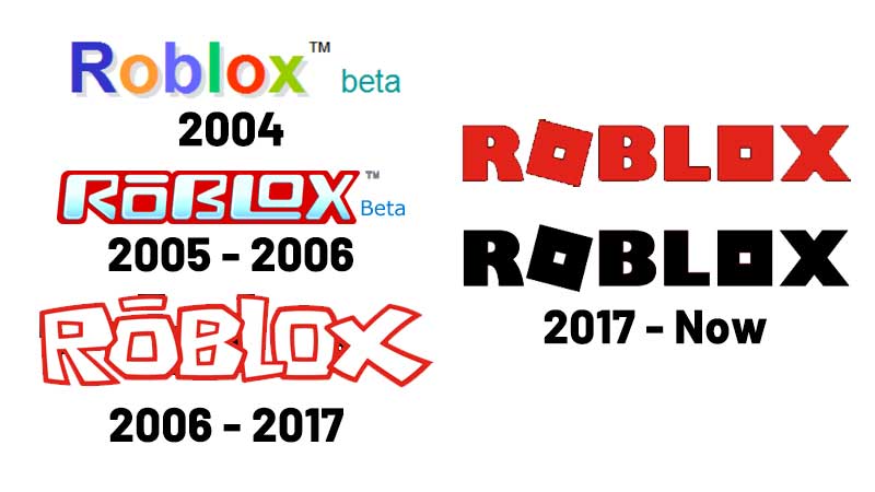
First, Roblox came out with its beta version in 2004 which was initially called DynaBlocks. Then, a year later, it was changed to Roblox and this is how the logo used to look like. It was simple, colorful and almost looked like Google’s logo. Then during 2004 – 2005, the Roblox logo got a massive transformation. They got rid of all the different colors and kept only white, bluish grey and red. We will look at the updated version of the same in 2005.
Roblox Logo [2005 – 2006]
As you can see, the logo became more ‘square’ which is pretty on-brand. Roblox gave it some rounded corners, a line above the first O and the grey tone reduced to more of a bright blue. It surely stands out and this is where the red outline, which became kind of iconic for Roblox, started out. Since the platform is based on a block-aesthetic, this logo conveys the same in a pretty cool manner.
Roblox Logo [2006 – 2017]
This was the logo that stayed for the longest period but it did get some tweaks during its time. It started out being bright red and then for 5 years, it had a dark red outline and the font stayed white. Then during the last two years of its lifetime, the outline color became more of a muted red. The overall font was unique and when I look at it, the first thing that comes to my mind is – fun. And that’s exactly what Roblox delivered.
[2017 – Now]
This is the new generation logo that we see every day now. As you can see, they completely removed the ‘outline’ format, got rid of the jazzy logo and gave it more of a blocky-aesthetic, something they are especially known for. It does look more serious now, due to the font choice. But as per their blog, they were going for a simple, clean, timeless logo and they have succeeded. The two Os in the name look like the heads of Roblox characters and this logo is available in red and black variants. The black version is used more frequently and is their main color now.
So, there you have it. This was the transformation and evolution of the logo from 2004 to present. If you want to know about the history of Roblox logo straight from the developers, don’t forget to check out their post here.
If you want to know more about Roblox games, the codes you can redeem for in-game freebies and more, check out our Roblox guides section on Gamer Tweak.


